Moto Z Force Review
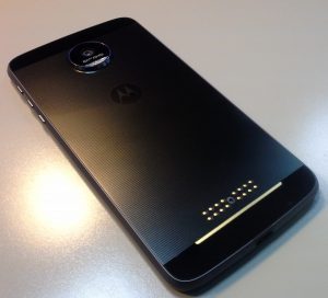
 The Motorola (Lenovo) Moto Z Force came out earlier this year, but I’ve only just now gotten my hands on it. I chose the Z Force (rather than the Z) because of the shatterproof screen and the heftier battery. Otherwise you’ll find that most, if not all, of the specs are the same between the two devices.
Let’s take a look at what’s in the box. The box itself is a little on the large side, but who’s measuring? You’ll see the phone itself first thing when you open the box. Underneath, you’ll find a wall charger, a USB-C to 3.5mm headset adapter and a few pieces of literature. A couple of things to note about this – the wall charger has a non-removable cord. So if you want to plug your phone into a computer to transfer data, you’ll need to shell out for another USB-C cable. It’s unfortunate, but not a deal breaker. The other thing to note is that little adapter. As you might have guessed, there’s no dedicated 3.5mm headset jack.
The only other thing I normally look for in the box is a set of earbuds. Unfortunately, none are included with this device. Most audiophiles will have their own favorite headset anyway, so for most this shouldn’t be a big deal.
While I’m on the subject of earbuds and USB-C and adapters, I should note that I did a quick search for USB-C to 3.5mm and USB-C (so I could charge the device and listen at the same time), and I didn’t see anything right off. That doesn’t mean such an adapter doesn’t exist, but it certainly isn’t yet a popular item. This also shouldn’t be a problem with the large battery in this phone.
Let’s take a look at the phone itself now. The display is very nice. It isn’t quite up to the standard of some of the latest Samsung devices, but you won’t be disappointed in it either. Colors are vibrant, details are sharp. Outside viewing is ok, but not the best.
Motorola’s answer to other manufacturers’ always-on display is a feature that lets you see your notifications without ever touching the phone. You simply put your hand near it, as if to pick it up, or wave your hand over it. The display lights up with the time and any notifications you may have waiting. You can act on those notifications, or after a few seconds the display will fade back out. Over time I’ve found this very helpful, and is a nice touch over having an LED constantly blinking at you (which can light up a dark room at night more than you want sometimes!).
Using the phone is very smooth. I’ve yet to find a way to make it lag in any way, with the exception of using it as an app is updating. Otherwise, moving from screen to screen, app to app is faster and more responsive than any other device I’ve ever used. Benchmarks largely show this to be the case as well when compared to most other devices, but I won’t get into that here.
The interface on this phone is as close to stock Android as you’ll get without buying a Nexus or Pixel device. Without having heavy skins on top of it, it allows the OS to respond very quickly without dealing with the overhead of that skin. This is refreshing in some ways, but in others it isn’t quite as ‘pretty’ as other manufacturers’ devices. One of the first things I do with any phone I get is to install Nova Launcher, which for me makes using any phone pretty familiar.
Also looking at the front of the Moto Z, there’s sort of an awkward fingerprint reader at the bottom. It looks like a button, but it isn’t one. However, it is one of the fastest fingerprint readers out there. I’ve had no trouble getting accustomed to using it to wake up the phone, and have only had to adjust slightly to using the on-screen navigation buttons to get ‘home’. Putting your finger on the fingerprint reader while the phone is awake will also cause it to lock. This also took a little getting used to, but it is second nature for me now.
 The camera is actually a little nicer than I expected. Weighing in at 21MP, it delivers sharp (sometimes over-sharpened) photos, most of which are well exposed and lit very nicely. It does include an HDR mode to tone down the highlights and get more details out of the shadows and it does a nice job of achieving that.
The cool thing about the camera is that Motorola has included a full-manual mode that allows you to set your exposure, adjust your white balance, changer your ISO settings, your shutter speed and your focal length.
 As mentioned earlier, the Moto Z Force has a pretty large battery. A 3500 mAh battery, to be exact. In my normal use, I’m generally getting about a day and a half of usage out of it. If I watch quite a few videos, I get less, but can still easily get a full day out of it. As I’ve mentioned in other posts, I’m not a generally heavy user, but I would consider myself average as far as screen time. The large battery coupled with the turbo charger is very nice – I can get a full charge in a little over an hour.
Phone calls are clear, as should be expected with any modern mobile phone. I’m a Verizon customer, so I use their Advanced Calling features, which is basically Voice over LTE. There’s nothing spectacular about phone calls – they just work as you’d expect them to. One nice feature to note is that the speaker used when you put someone on speaker phone is in the front of the device. In the same spot as the earpiece. It isn’t of phenomenal quality or anything, but the fact that it’s actually facing you, as opposed to most other phones having them on the bottom pointing downward, or even on the back, is a huge plus.
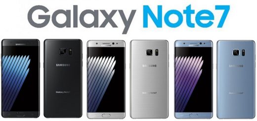
In summary, I’ve been pleasantly surprised by this phone. I picked it up to replace my recalled Note 7. While no other device on the market today will quite match some of the features I loved about the Note 7, this one substitutes extremely well for the rest of what the Note 7 offered me – a fast, solid device that handled everything I threw at it with ease.


